Choosing a Wedding Color Palette (Without Overthinking It)
Don’t Overthink It: Choosing Your Wedding Color Palette
Choosing a wedding color palette is often one of the first design decisions couples make—and one of the easiest places to feel stuck.
Pinterest boards fill up quickly, inspiration photos start blending together, and suddenly it feels like you’re supposed to choose from thousands of possible combinations. For couples in the early stages of beginner wedding planning, this can feel overwhelming.
The good news? A beautiful wedding color palette doesn’t have to be complicated.
If you’re wondering how to choose wedding colors, start by thinking of your palette as a guide that helps every design decision feel cohesive and intentional.
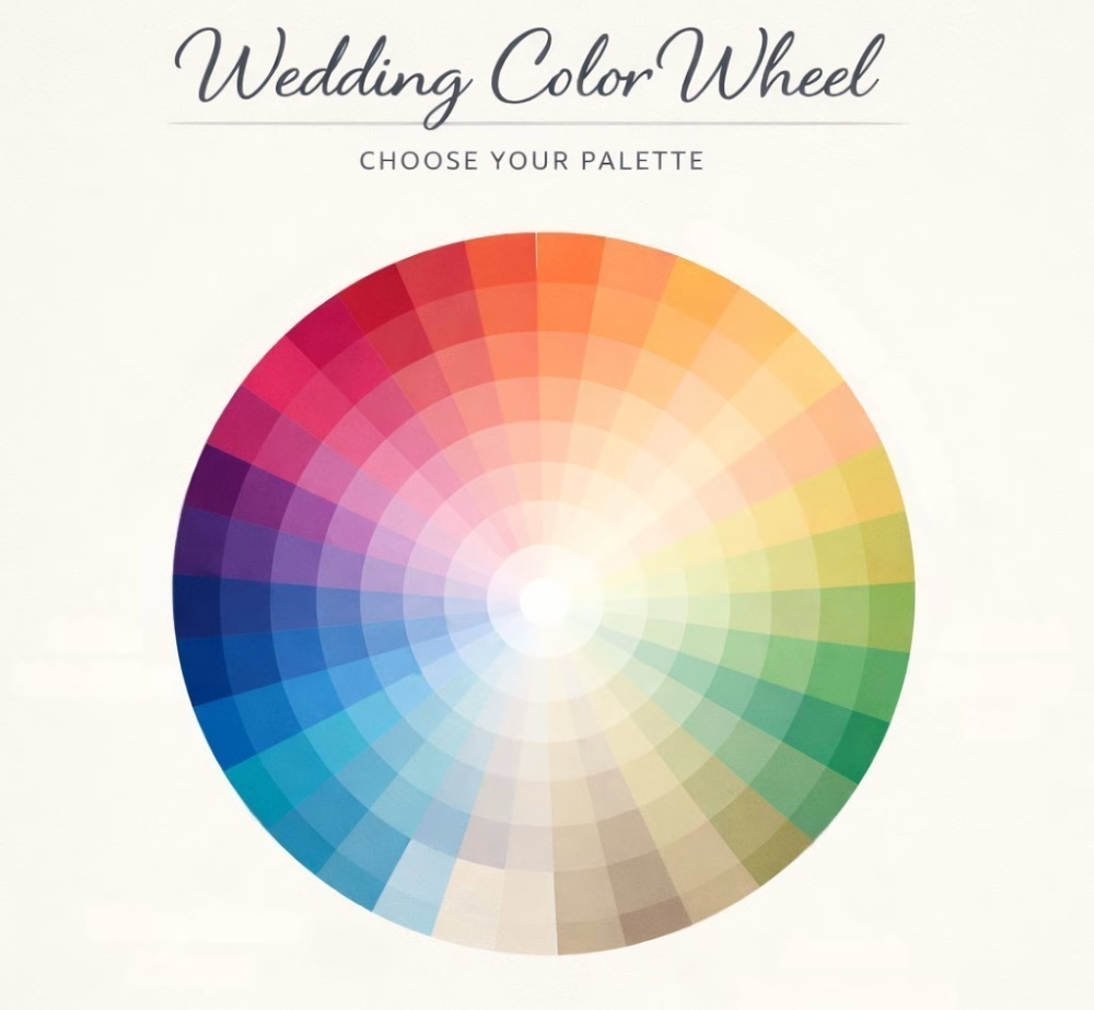
Start with a Simple Color Formula
When couples ask me how to choose wedding colors, I recommend starting with a simple formula. A well-balanced wedding color palette usually includes:
- 1 main anchor color
- 1–2 supporting colors
- 1–2 neutral tones
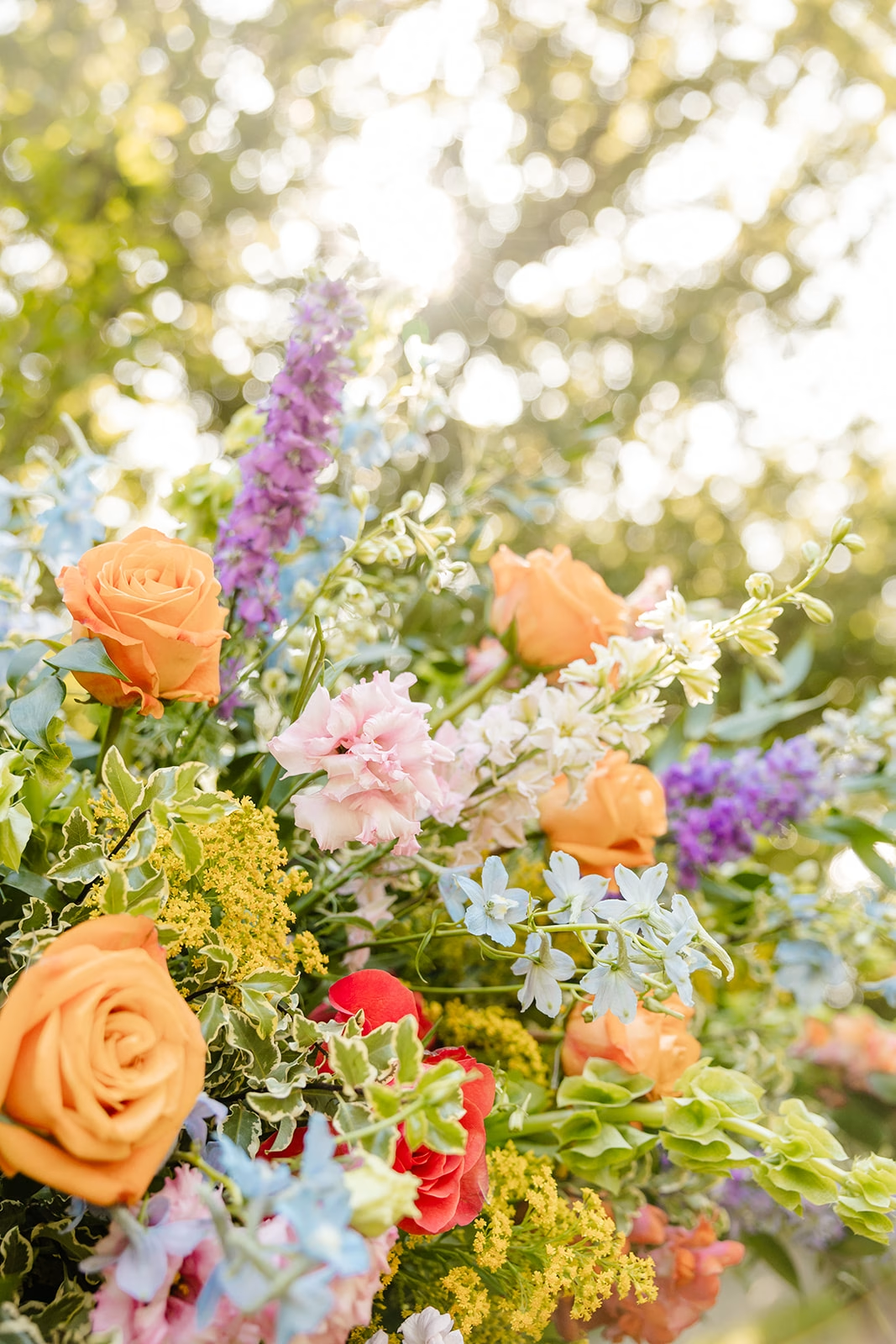
Your anchor color sets the overall mood of the wedding. How do you want your event to feel? Think romantic blush, classic black, timeless ivory, modern red, playful coral, rich plum, whimsical lavender, or bold chartreuse.
Supporting colors add depth and variation.
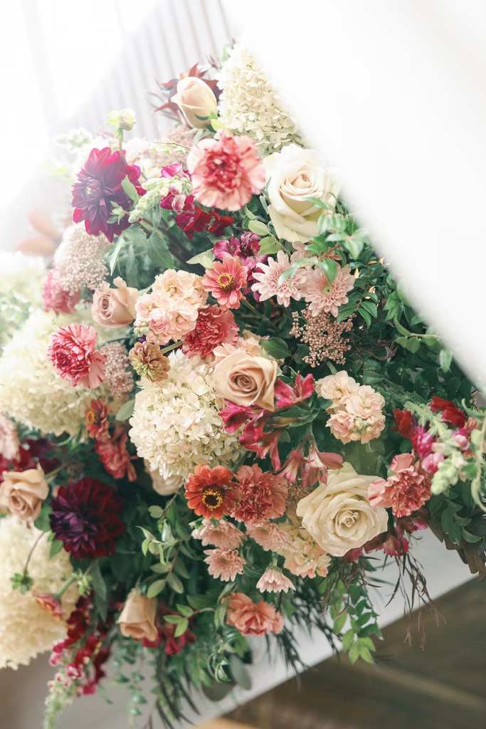
Neutrals—like white, cream, champagne, taupe, or soft gray—allow the other colors to breathe and keep the palette from feeling overwhelming.
One helpful mindset shift when choosing wedding colors: your palette doesn’t need to match everything. It simply needs to guide everything.
Florals, linens, attire, stationery, and lighting don’t have to be identical shades. In fact, subtle variation is what creates a layered, thoughtfully designed look.
These small decisions are some of the most important wedding design tips couples can follow early in the planning process.
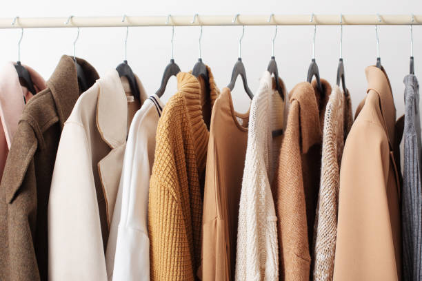
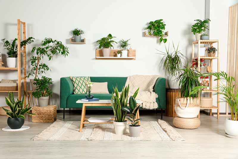
Look to Your Everyday Preferences for Inspiration
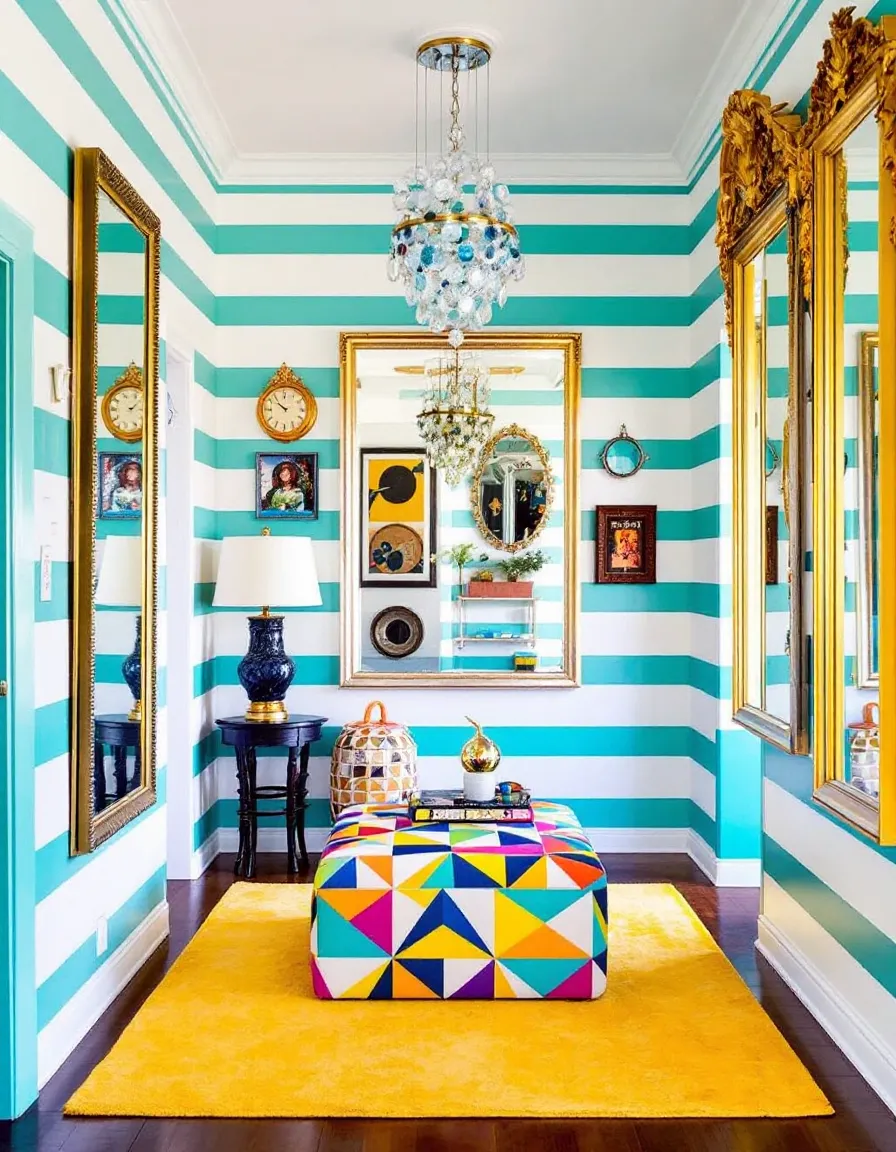
If you’re not sure where to begin, start with things you already love. Some of the best wedding color palette ideas don’t come from wedding inspiration boards at all. Your personal taste often reveals itself in everyday places like:
- Your home decor
- The clothes you gravitate toward
- Places you enjoy spending time
- The seasons you naturally feel drawn to
These preferences can help point you toward colors that already feel authentic to you as a couple.
Your wedding design doesn’t have to come from a trend board. It can reflect your real life and the things that already inspire you. When it does, guests often walk into the space and immediately think, “Wow, this is so them.”

Don’t Forget the Venue’s Built-In Color Palette
One element couples often overlook when choosing a wedding color palette is the venue itself. Every venue already has a built-in color story created by its architecture and interior elements—things like floors, walls, furniture, and lighting.
For example, a venue might already include elements such as:
- Black leather booths or chairs
- Off-white walls
- Warm wood or brown floors
These existing features become part of your design whether you plan for them or not. Think of them as your background canvas when building your event design color palette.
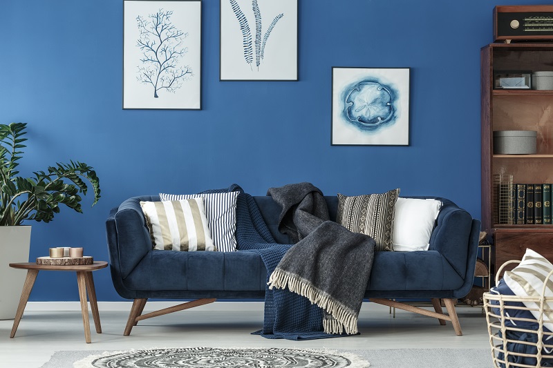
Why Contrast Matters in Wedding Design
This is where contrast becomes especially important.
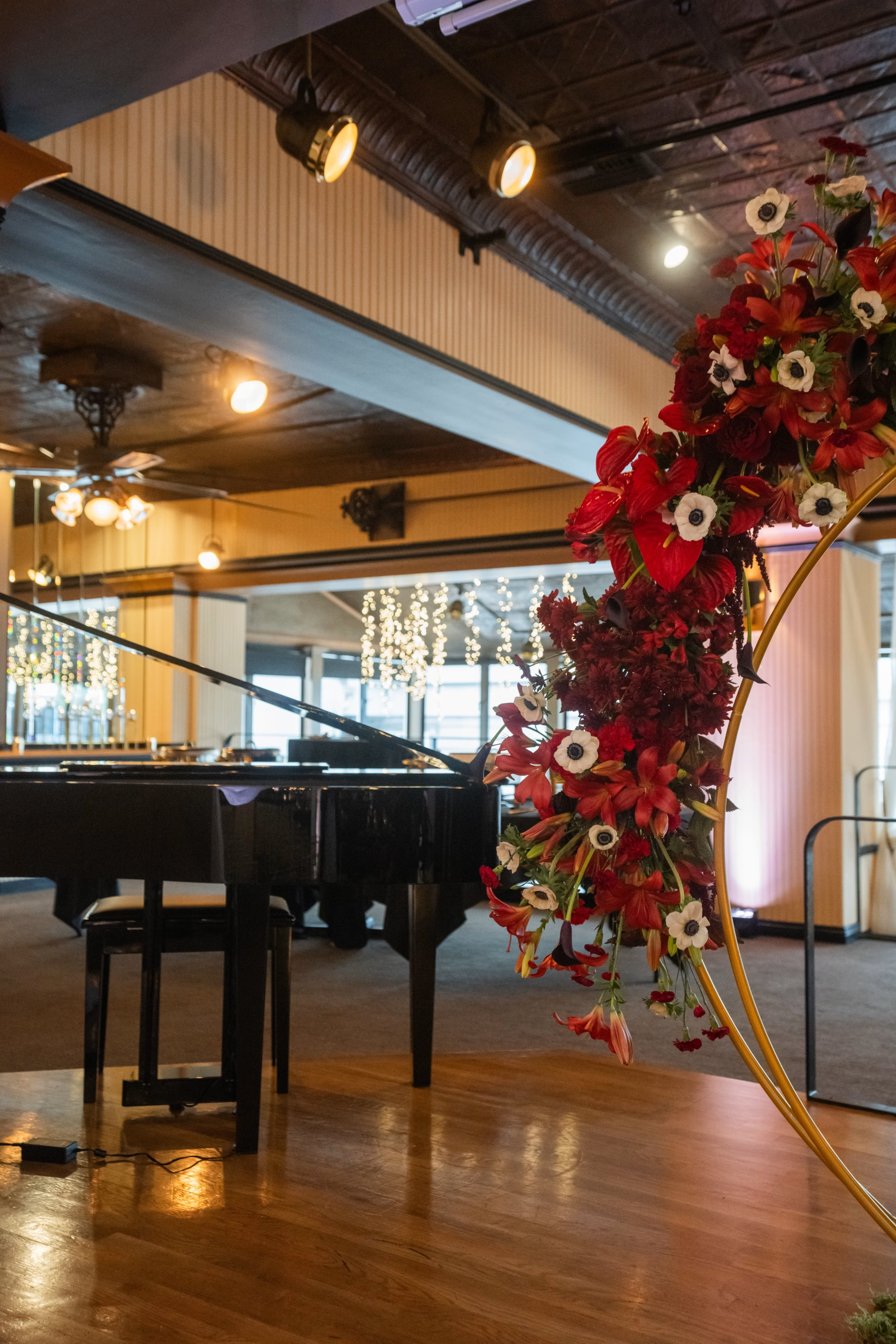
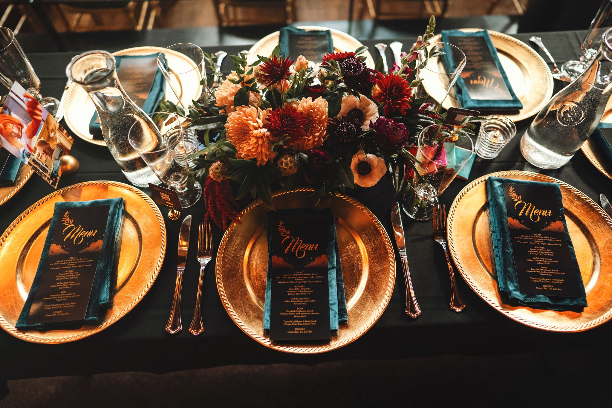
Soft palettes—like pastels, light blues, blush tones, or white-on-white florals—can be incredibly beautiful. But they often need a deeper anchor color to keep the design from visually disappearing. For example, imagine light blue and white florals placed on white table linens in a room with white walls. Without contrast, the flowers and linens can start to blend into the background.
Now imagine those same florals placed on a darker linen—sandy beige or denim blue for a lighter summer palette, or midnight blue or espresso for fall and winter weddings. Suddenly the flowers stand out. The entire design feels more intentional, dimensional, and visually striking.
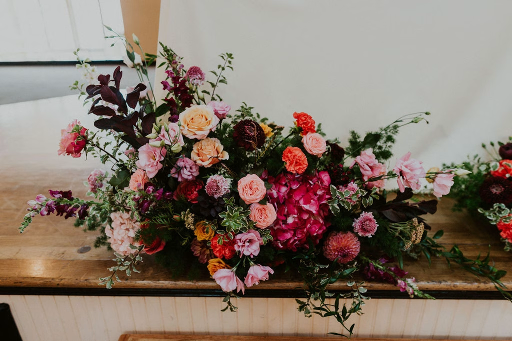
Contrast is just as important for outdoor weddings, where the natural landscape becomes your backdrop.
If your ceremony takes place in a lush green setting—like a garden, forest, or vineyard—designs that are heavily greenery-based can sometimes blend into the surrounding environment.
Instead, couples often choose floral designs that feature bright colors, bold blooms, or crisp white flowers. These stand out beautifully against a green landscape and create a stronger visual focal point for the ceremony.
When choosing wedding colors, consider:
- What colors already exist in the space
- Whether your backdrop is light, dark, or natural
- Where you want guests’ eyes to land
Contrast is what creates visual depth—and it works at every budget level.
The Goal Isn’t Trends. It’s Cohesion.
It’s easy to get caught up in trending wedding colors each year. But the most successful palettes aren’t trend-driven—they’re thoughtfully applied.
A clear wedding color palette helps every design element—from florals to linens to lighting—work together to create a cohesive atmosphere.
And when that happens, the entire event feels more intentional, welcoming, and memorable.
For couples navigating beginner wedding planning, focusing on cohesion rather than trends is one of the most helpful wedding planning tips to keep the design process simple and enjoyable.
Read More:
Read Other Useful Wedding Articles
Featured Photo Credit: Sasha Reiko Photography preferred vendor
Additional Photo Credits:
- French Sessa Photography
- tmInspired Photography preferred vendor
- Sola Lee Photography
- Piero Manriq Photography preferred vendor

Nicole Paniagua, Event Design and Floral Manager, Imperia Lake Union
Nicole initially fell in love with flowers as an organic flower farmer. She combines her seasonal grower’s knowledge together with an artistic approach and 8 years of design experience – bringing joy, color, and texture to all spaces. She finds fulfillment in connecting with someone else’s vision and bringing it to life with unforgettable florals.